Complete Example
For a quick introduction to the capabilities of the Processifier visual you can download the sample report
The prerequisites include:
- Event log file with the following columns (you can use sample data available here):
- unique case identifier,
- activity name,
- start of an activity,
- end on an activity (optional);
- PowerBI Desktop installed on your local desktop machine or PowerBI service available through web browser;
- Processifier Utility tool PFUtil that transforms Event Log data to the data model that is understandable by the visual;
- You should have Python interpreter installed (Python vesrion >= 3.9) along with package-manager (we use PIP);
- Processifier Process Mining PowerBI Visual (in the near future it will be available in Microsoft AppSource). For the full version of the visual contact us;
- You can use our sample report to make first installation easier.
Data Preprocessing
Install required packages
In order to transform data into the model that is used by the visual you have to download / checkout PFUtil. Once you did that, you have to install all the requirements from requirements.txt file. Using PIP package-manger from within the source directory you can do it in a following way:
pip install -r requirements.txt
Transform Data
Once all required packages are installed you can transform an event log in a form of CSV file to the model required by the visual. Assuming you are in the main directory of PFUtil you can use provided example from the example_data directory.
The general format of command line pfutil tool is as follows:
pfutil -c CONFIG_FILE put -e EVENT_LOG_CSV_FILE --csv-out OUTPUT_DIRECTORY
It's parameters:
CONFIG_FILE- config file in which you can change default names for the columns and specify timestamp format,EVENT_LOG_CSV_FILE- an input csv file containing event log data,OUTPUT_DIRECTORY- the output directory containing output CSV files that are used in PowerBI as a model source. In the sample PBIX file this directory can be directly connected as a data source through parameter (see section "Connecting data to the visual").
In our case parametrization using example data with simple purchase-to-pay process will take the following form
./pfutil -c example_data/p2p_short/config.yaml put -e example_data/p2p_short/output_data.csv --csv-out output
Provided that the above command finished without errors, in the output directory we will now have CSV output files that together serve as a data model required in the next step.
Connect data to the visual
Now you are ready to connect your data to the visual. You will need OUTPUT_DIRECTORY and all the files it contains.
Use Sample PBIX file
This is the easiest way to populate visual with data.
- First you need to open
processifier-process-mining.pbixfile in PowerBI:
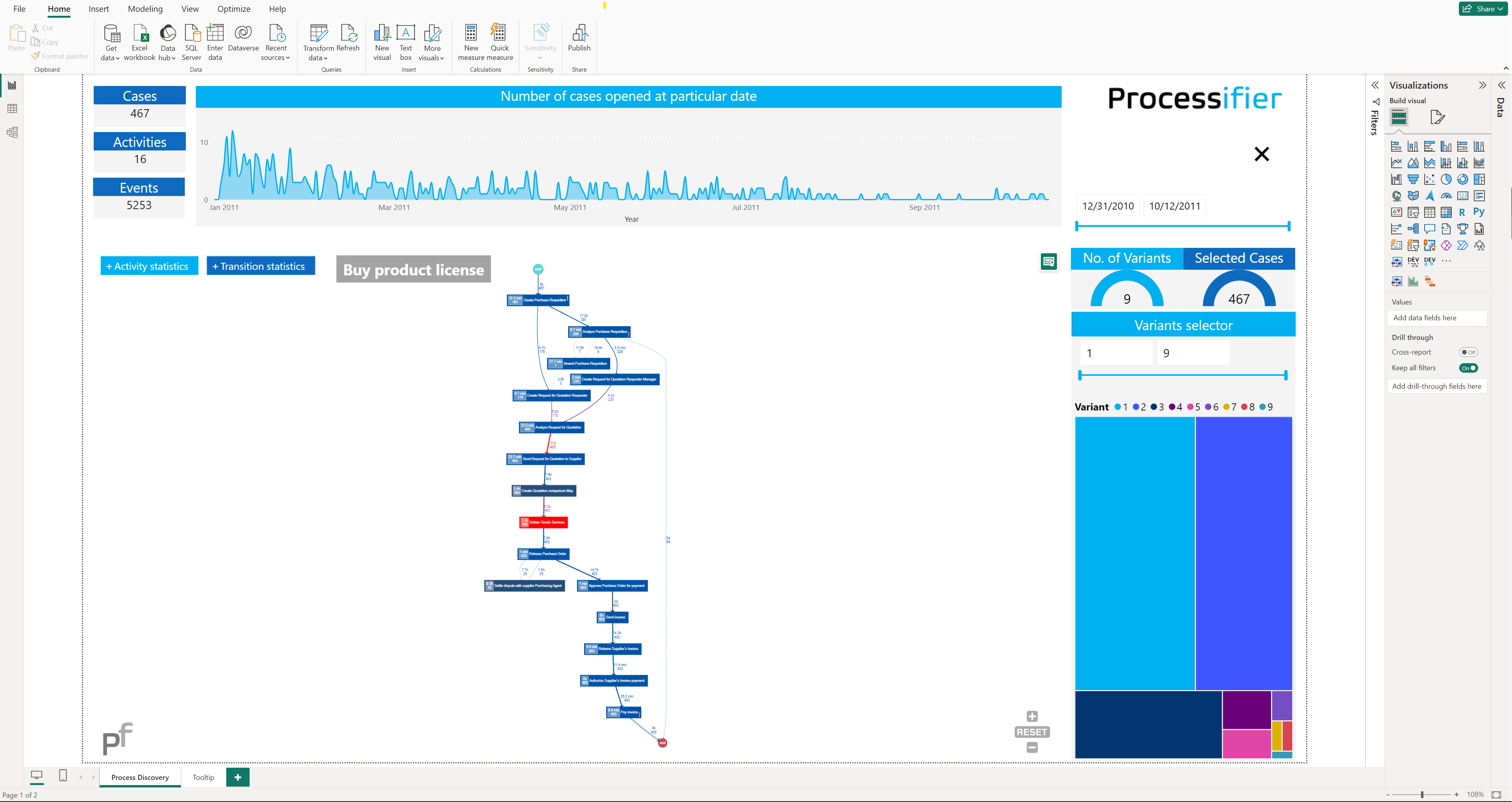
You should see the default simple Purchase-to-Pay example.
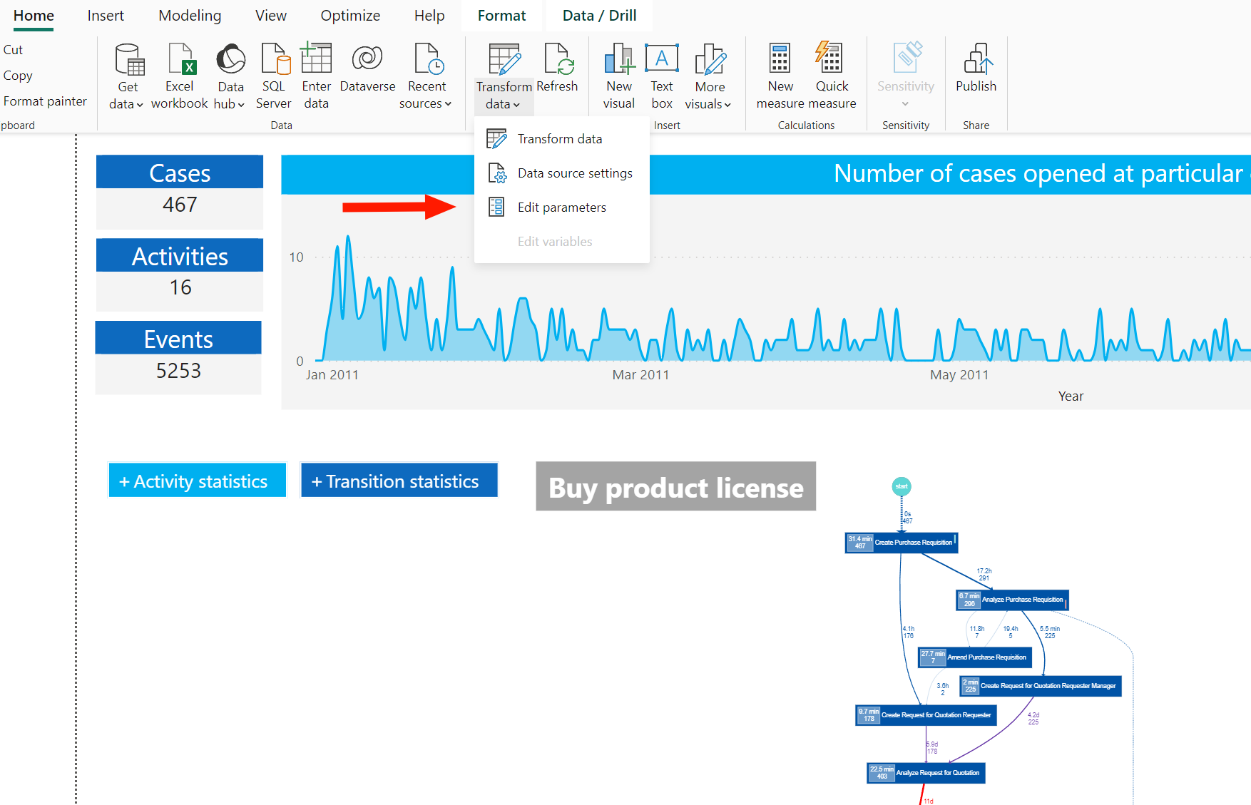
- Next go to "Transform Data" → "Edit parameters"
- There should be a default parameter
path_to_datathat you should fill with an absolute value to theOUTPUT_DIRECTORYthat was set at the previous step.
You may provide your own path provided that you copied all the CSV files from the OUTPUT_DIRECTORY to the directory of your choice.
Connect visual from scratch
If you would like to add the visual to any other new or existing report you have to properly assign columns from appropriate tables in model to the fields in the visual. Below table explains how you should make these connections.
| Visual Field | Required | Table | Fields | Description |
|---|---|---|---|---|
| Node names (source, target) | yes | eventlog | activity, activity_next | Source and target nodes that define the connections in the graph |
| Node first value (color) | no | eventlog | activity_duration_h | tatictics to be displayed on the node. Defines node color: values from this field are normalized and mapped uniformly to the color from the pallete defined in the config pane (Node > First color pallette). See also: 'Node second value'. |
| Node second value | no | eventlog | case_id | Statistics to be displayed on the graph node. If 'Node first value' it not specified then defines node color: values from this field are normalized and mapped uniformly to the color from the pallete defined in the config pane (Node > Second color pallette). See also: 'Node first value'. |
| Edge first value (color) | no | eventlog | transition_duration_h | Statictics to be displayed on the edge. Defines edge color and if Edge second value is not specified then thickness as well. Values from this field are normalized and mapped uniformly to the color from the pallete defined in the config pane (Edge > First color pallette). If Edge second value is not specified then this value defines thickness as well. See also: 'Edge second value'. |
| Edge second value (thickness) | no | eventlog | case_id | Statictics to be displayed on the edge. Defines edge thickness: values from this field are normalized and mapped uniformly to the thickness from the range defined in the config pane (Edge > Max thickness). If Edge first value is not specified then this value specifies color as well. See also: 'Edge first value'. |
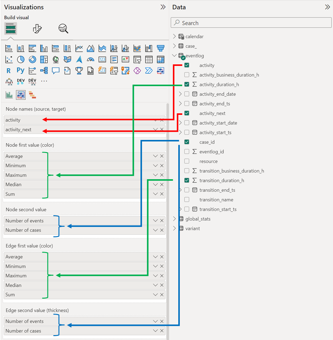
Below you may find an example of how to connect columns from the model to the specific visual's fields. To draw the basic graph you only need to provide 2 values for the first field, namely activity and activity_next (red arrows in the image):
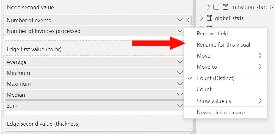
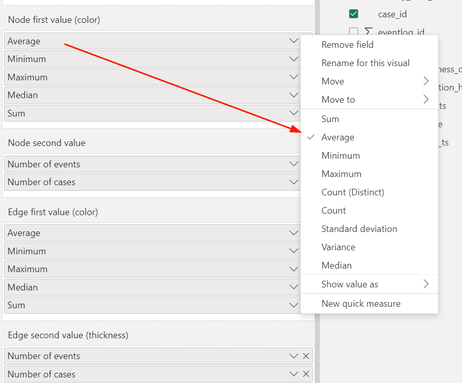
Choosing which statistic should be computed on a specified field leads down to selecting it from the dropdown menu:
You can also easily change its name according to your needs and the business context: